

TAMA APP DESIGN
A Safe Hub Where Users Can Focus on Mental Wellness
TIMELINE
Sep. - Dec. 2023
ROLE
Sole UI designer
STRATEGIES
Prototyping, UI design
TOOLS
Figma, Procreate

Overview
A safe hub for users to support their mental well-being.
Tama is an iOS app that enables users to access beneficial features designed to support mental well-being.
For my User Interface Design II class, I was tasked with developing an interface that addresses a common problem faced by many. We received a selection of topics to focus our interface on, and I choose to center mine around mental health.
Problem
Being open about mental health struggles can be terrifying.
However, opening up can help reduce stigma and create a supportive community where individuals feel comfortable seeking help and sharing their experiences.
That's why I developed Tama, an app that simplifies reaching out to a community or seeking professional help.
Low-Fi Sketches
Starting the design process.
Before moving on to Figma for screen creation, I outlined some basic sketches of the primary features I planned to integrate into the app. These features include a home page for quick access to specialists and emergency helplines, a mood tracker for daily mood and activity monitoring, and a community hub where users can engage either anonymously or with self-identification.
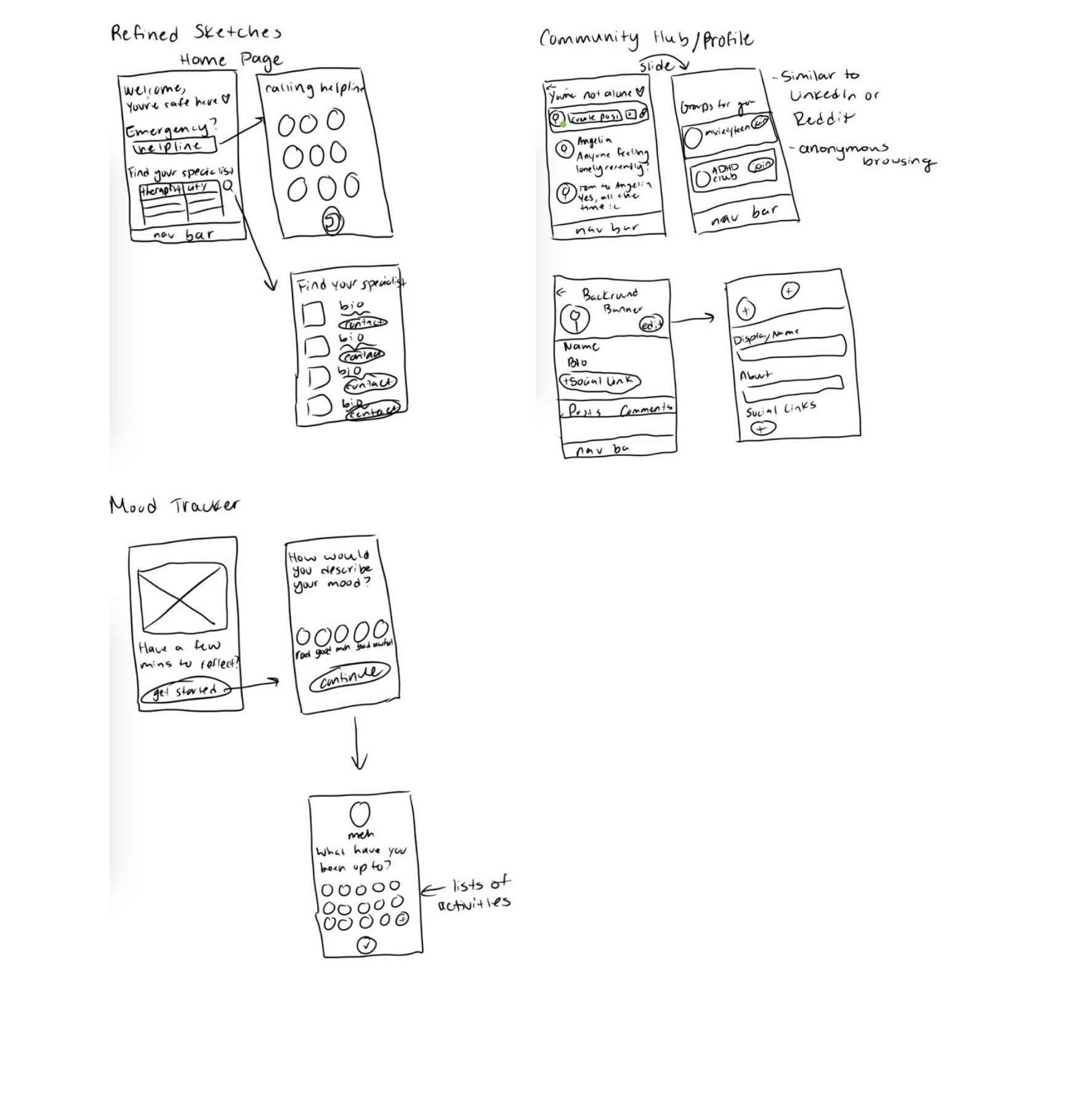
Rough sketches from IPAD
Inspiration
I took inspiration from PyschologyToday.com for the filter option between specialists, but I also wanted to add onto some of my own touch to the interface. I wanted to add a way where the user could input their insurance first before having to search through multiple specialists that don’t even take insurance.
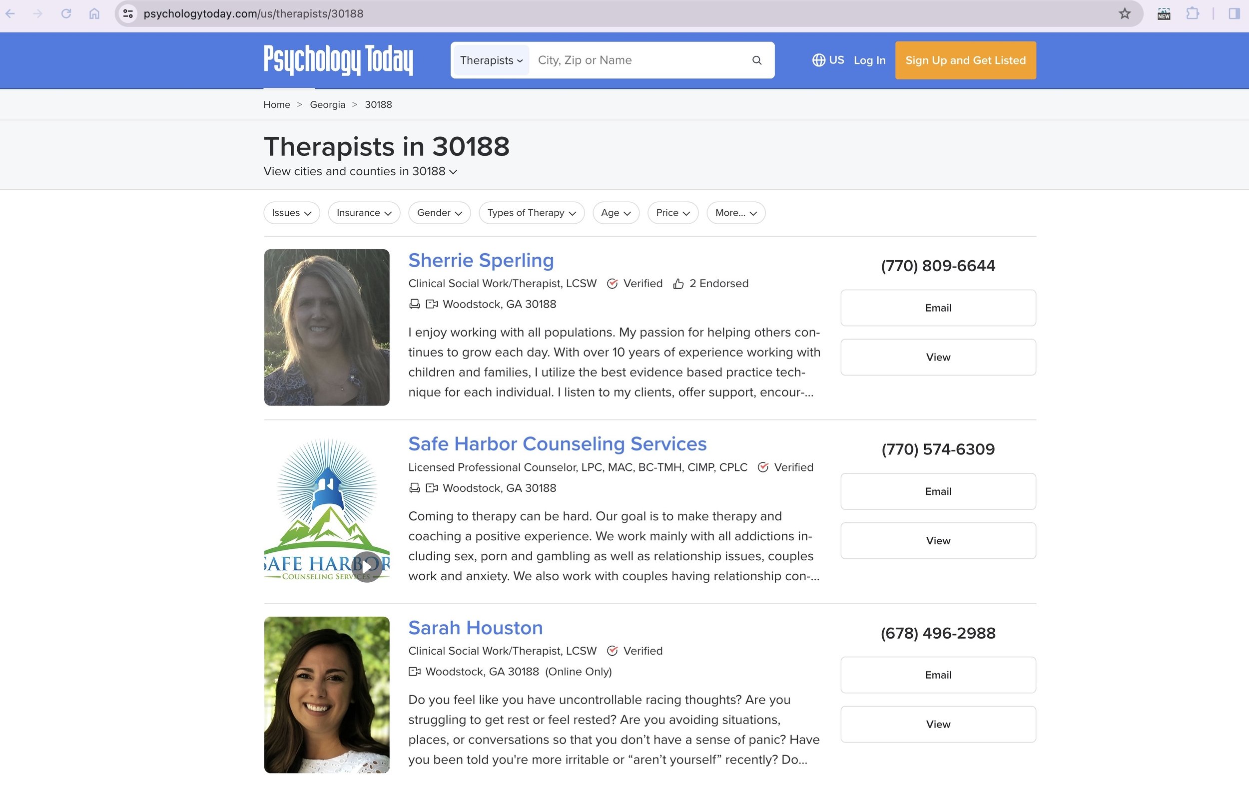
Psychology Today filter page
Onto Figma!
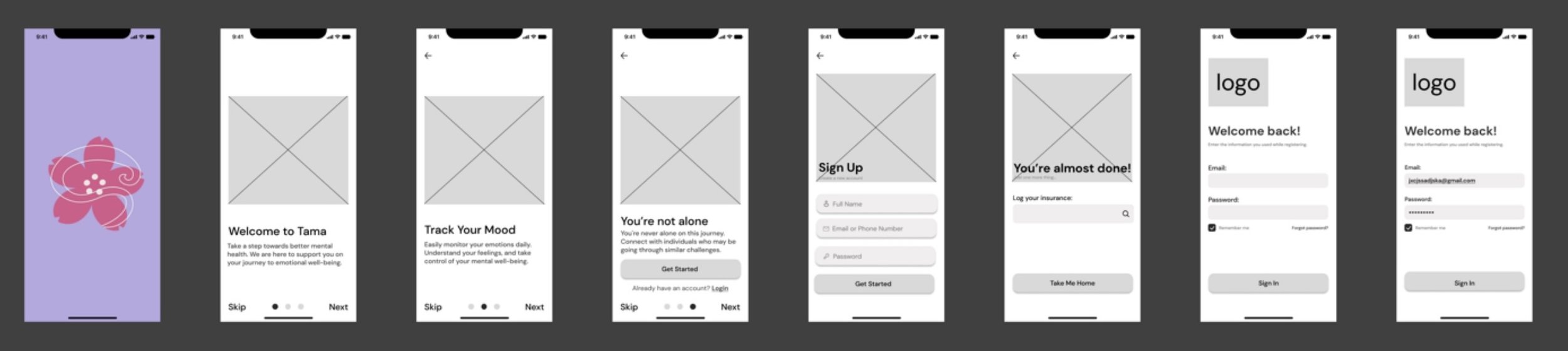
Starting the wire-framing.
I started using Figma to create the required screens for the app. I chose a more detailed wireframing approach to speed up the later design process.
Onboarding
I designed an onboarding section to introduce users to the app and facilitate account creation. Additionally, I incorporated a feature enabling users to input their insurance details, making it convenient for them to discover specialists within their coverage.
Wireframes of Onboarding Section, Figma
In case the user feels insecure or poses a risk to themself, they may effortlessly get the helpline number by visiting the support center/home page that I have included. To make things easier for the user, I also included a shortcut to the navigation bar. Additionally, I have a section where the user may select the type of specialist they want. After selecting a specialist, a list of several specialists with their name, bio, and connect button will appear.
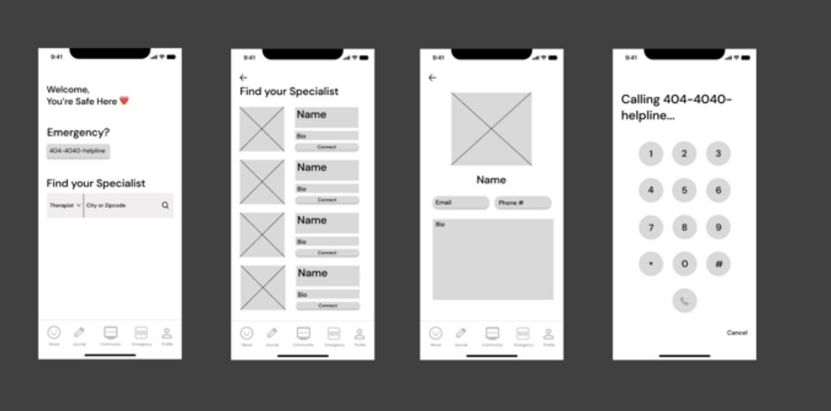
Wireframes of Help Center/ Home page, Figma
Mood Tracker
I included a mood tracker so that users can keep tabs on both their daily emotions and their everyday activities. The choice to share with friends is offered to them.
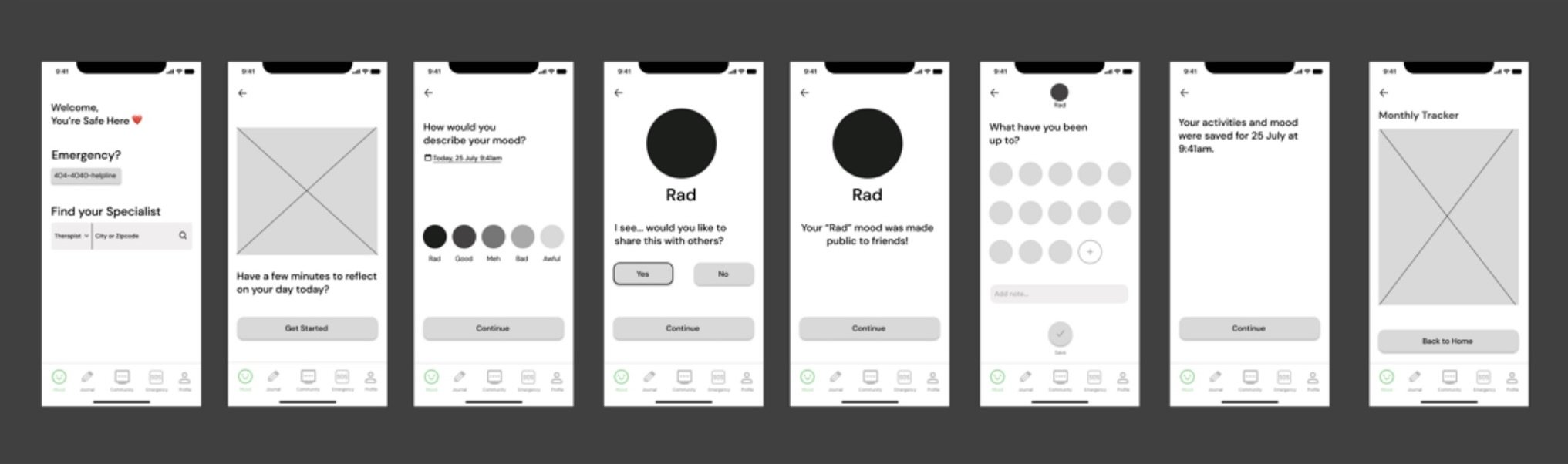
Wireframes of Mood Tracker pages, Figma
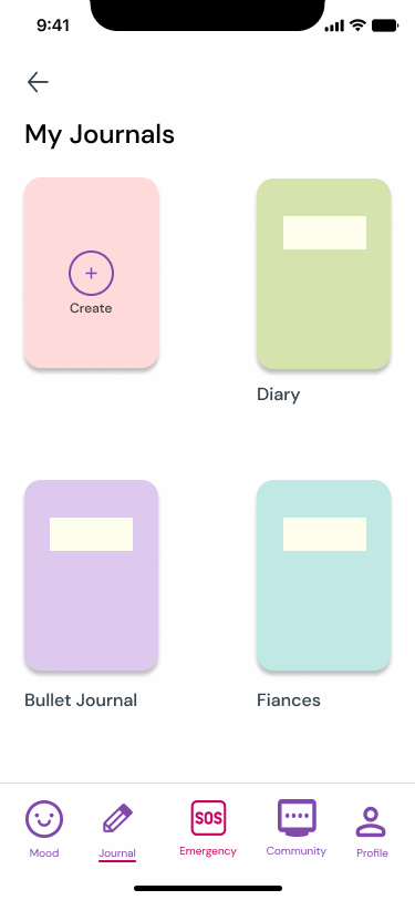
Journal
I'm inlcuded a journaling page where people can write anything they want to write in different diaries, including their feelings. It will have a straightforward design that is a lot like Apple Notes and Kilo notes.
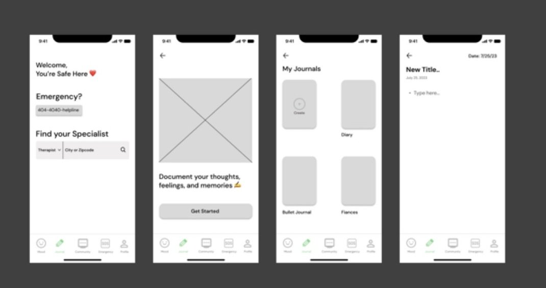
Wireframes for Notes/Journal pages, Figma
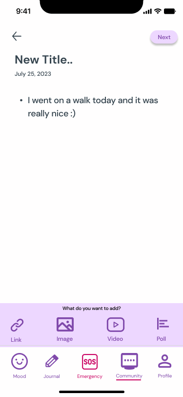
Community Hub
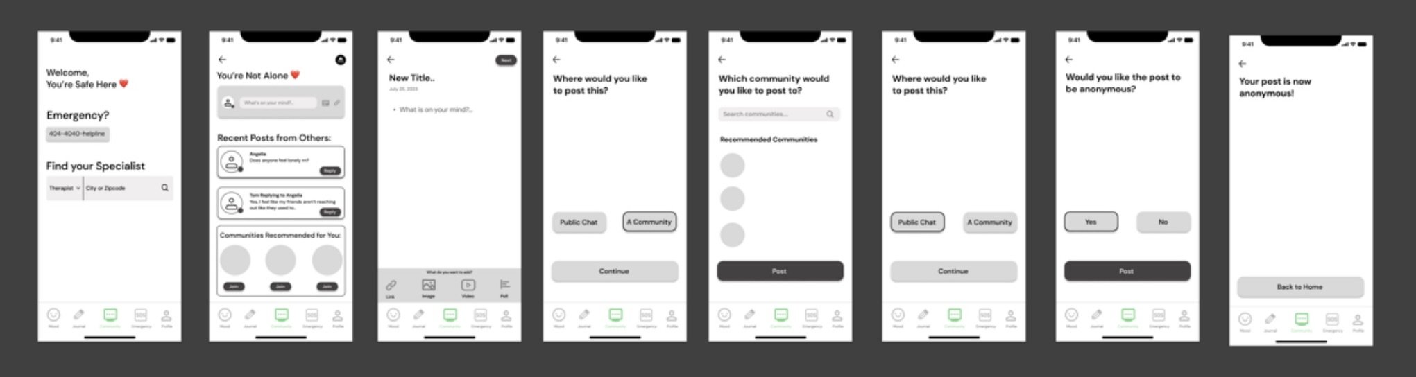
Additionally, I'll be adding a community hub where app users may communicate with one other in public or privately. Users would have the opportunity to discuss problems they are having with others and not feel so alone because others might be experiencing similar things. Additionally, the user will have the opportunity to interact socially in those settings by choosing to join other groups that are focused on a particular problem or interest. I attempted to mimic Reddit's layout somewhat.
Profile
Wireframes of Community Hub pages, Figma
In order to allow users to interact with others outside of the app, I will also be incorporating a profile page where they can edit their information and add links to social media.
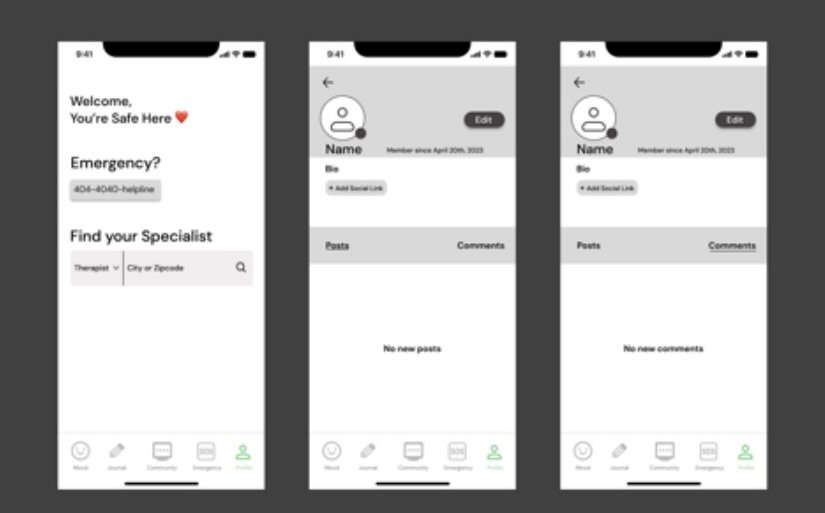
Wireframes for Profile Pages, Figma
Help Center/ Home Page
Final Prototype
Style Guide
Before I started designing I wanted to set my boundaries for design. I came up with my color scheme, icons, and typography.
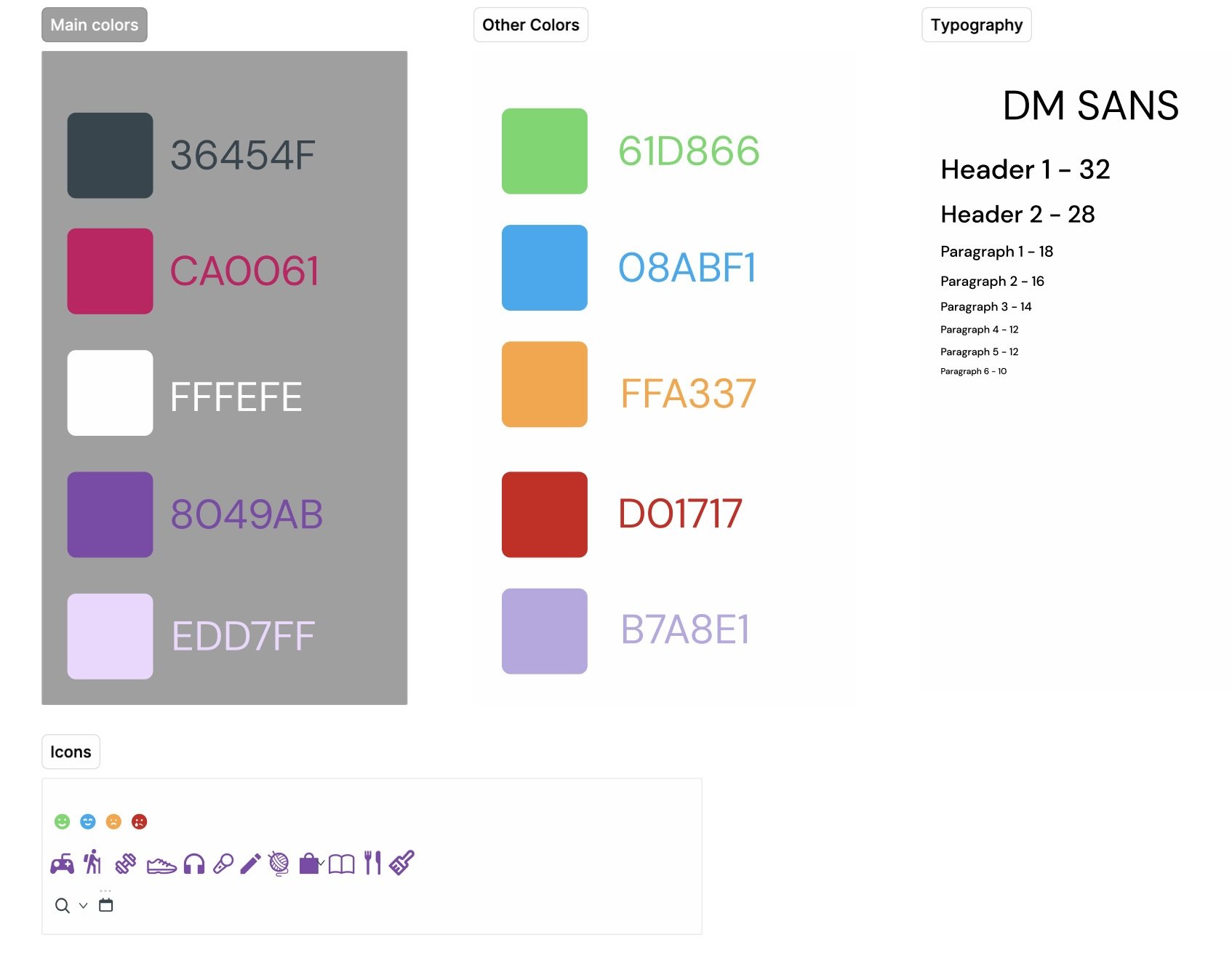
Style Guide for Tama, Figma
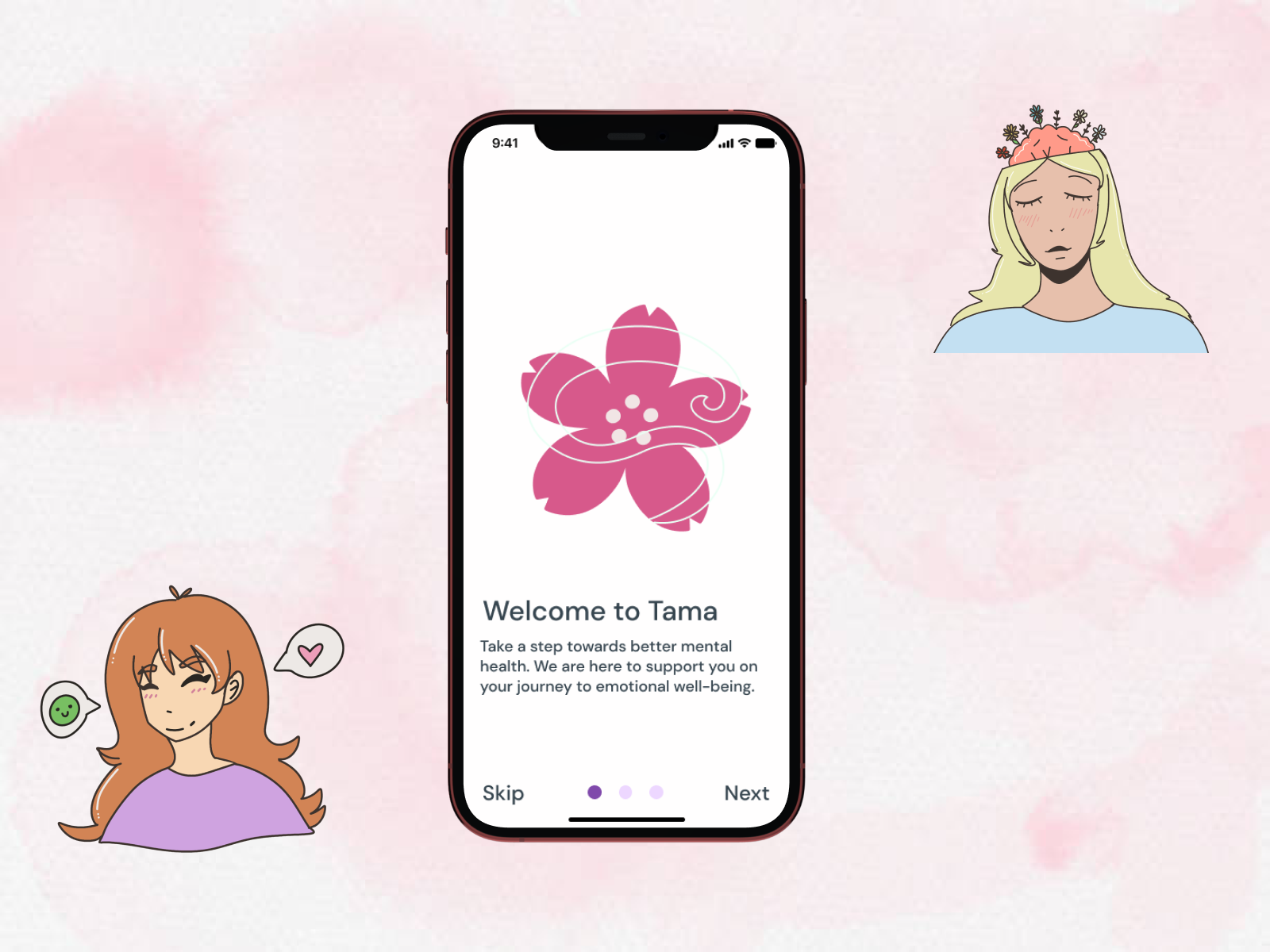
Onboarding Final Design
I created a straightforward graphic for each onboarding screen to introduce the product because I wanted to use a lot of my own images when the screens were finished.
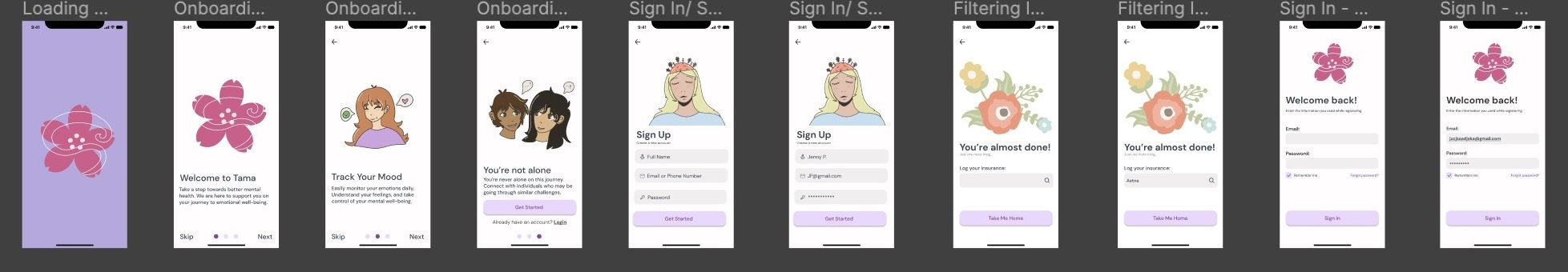

“Track Your Mood” Graphic, Procreate
Help Center/ Home Screen Final Design
In the end, I aimed for a very noticeable and user-accessible design that was overall rather simple and uncomplicated.

Mood Tracker Final Design
I gave the screens lots of life and color, and included a full month calendar where the user can track their moods and activities.

Journal/Notes Final Design
In order to help the user stay organized with their thoughts, I gave them a lot of customization options and the ability to keep multiple journals.

Community Hub Final Design
Profile Final Design
Onboarding Finished Screens, Figma

“You’re not alone” Graphic, Procreate


Main Home Page/Help Center Screens, Figma
Main Mood Tracker Screens, Figma
Main Journal Screens, Figma

Main Community Hub Screens, Figma


Sign Up Graphic, Procreate

Feeling secure, the user can regularly or anonymously talk to others about their life and its happenings. They have the choice to become members of public communities.

The user has the ability to alter their system settings and add more personalization to their profile. They can also view all of their posts and comments on the app.
Settings pages, Figma
Reflection
Overall, I had a great time working on this project, and I'm happy that I was able to realize my vision. Even though I wish I had more time to work on this project, I'm still pleased with the outcome as a whole.
I wish I had time to put user reseach into my app creation but designing just the UI was still really fun! ⊹˚. ♡.𖥔 ݁ ˖