

POKÉMON GO USABILITY TEST
Discovering Why Pokémon GO Lost Popularity
TIMELINE
Nov. - Dec. 2022
ROLE
UX Researcher, Technician
STRATEGIES
Usability Tests, Task Analysis, TAP
TOOLS
Microsoft Office Suite, Figma


Problem
Why choose Pokémon GO to test?
Since the launch of Pokémon GO, the number of active players has reduced by more than 50%.
The app was so popular a few years ago… What happened??
Introduction
I was apart of a group with three other designers in my Usability Testing class at my University. We were assigned to conduct a usability test on the Pokémon GO Interface for our final project for the class. We needed to ensure that we found possible solutions to make the interface more user friendly and easily assessable.
To find those possible solutions, our group was required to:
Draft the Test Plan
Identify frustrations/concerns
Heuristic Evaluation
Create Task List, Consent Forms
Recruit 5 participants for user interviews
Facilitate the Test
Interview 5 participants
Observe the participants by taking notes, screen sharing, and camera recording (all with consent)
Examine Case Data
Assess participant behavior
Assess navigation
Identify participant click patterns/path
Create the Final Report
Observe recorded video footage
Identify design issues/concerns
Provide interface recommendations
System Usability Scale (SUS)
Goal
Our team prioritized finding the appropriate objectives for this project before initiating the research phase:
To identify and evaluate the issues that users/participants of Pokémon GO come across.
To closely observe and analyze the behavior and interactions between the user and the interface of Pokémon Go.
To invoke user feedback on potential areas for enhancing the design of the app/game.
Frustrations/Concerns with Pokémon GO:
The glitchy GPS signal, which led to the player’s avatar moving when the player was still.
The lack of explanations for some key features within the app.
The unintuitive locations/shortcuts for some key features within the app.
Heuristic Evaluation
Our group conducted a heuristic evaluation on the Pokémon GO interface, utilizing Jakob Nielsen's 10 usability heuristics.
We discovered that Pokémon GO breaks these heuristics the most:
Heuristic #9: Helping Users Diagnose and Recover From Errors (weak GPS signal, with move in-game avatar inconsistently)
Heuristic #6: Recognition Over Recall (few in-game instructions, makes users relay on familiarity with other similar interfaces)
Creating the Task List
Once our team conducted some basic research and finalized our heuristic evaluation, our team created a task list of what our participants will be instructed to do during the usability test.
The task list included 2 parts:
Part 1: 11 different tasks were assigned (on a brand new Pokémon GO account).
Part 2: 4 different tasks were assigned (on an advanced/higher level account).

Consent Forms
For my team, I created the standard consent form (consent for interview and usability test) and the video consent form (consenting to being recorded (visual and audio)).
Recruiting Participants
One of my teammates and I gathered up participants from personal connections and asked if they wanted to participate in this usability test. They all agreed and we had them fill out a pre-questionnaire to ask them their age range, Pokémon franchise familiarity, Pokémon GO familiarity, technology familiarity, and more critical information we should know about our participants.


Findings
Once the participants answered the pre-questionnaire, we handed out the task list to them and began the usability testing.
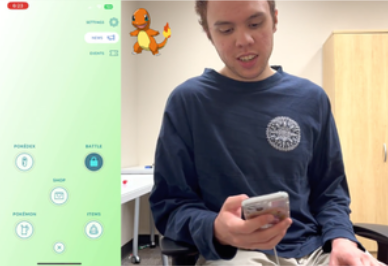
At the start, Participant 05 (Cyndaquil) and Participant 01 (Bulbasaur) faced issues with their avatars moving on the screen without any actual movement in real life. Therefore, catching Pokémon became more difficult as their screens tracked their characters.
Lack of GPS Error Feedback
The GPS confusion regarding the player's location and movement led to a shortage of Pokémon spawns. Participant 01 did not receive any GPS error messages, while Participant 05 received a "slow down" message despite not being in a vehicle, resulting in user frustration.


“My guy is a little confused, he’s running around the place” (Bulbasaur 01).
“It thinks I’m a passenger, but I’m definitely not. Not even moving” (01 Bulbasaur).
“It’s just running and there’s no pokémon spawning” (05 Cyndaquil).
The beginner participants mainly focused on using the pokéball menu to go through each task of the task list. The other four button options at the top right screen in the menu was viewed much less because the main focus was on the 5 bigger buttons on the bottom. This confused and frustrated Participant 02 (Charmander) and Participant 03 (Squirtle) when they tried to complete these three tasks (favorite a postcard, check nearby raids, and check the time they caught their first Pokémon).
Navigational Issues

“I think raid should be under the pokéball button, because I didn't really know about the nearby button so I would have just looked around on the screen to see them” (03 Squirtle).
“I wish they put more things in the pokéball button, as it’s the easiest way to interact with the interface” (03 Squirtle).
Unintuitive Shortcuts: Healing and Transferring Pokémon
Beginner players found it challenging to heal and transfer multiple Pokémon on the same page because there were no instructions provided during the tutorials. Even though it is possible, they were not aware of where to locate the feature.
The new players eventually learned that to heal their pokémon, they needed to access the item menu and choose a healing item. This would take them to a separate screen where they could heal their chosen pokémon.
“I clicked on a pokémon, I see new attack and power up. I don’t see potion, so maybe I'm gonna leave and click the pokéball, then items, then potion. Now I see pokémon.” (02 Charmander).
The beginner participants experienced a significant increase in the duration of Part 1 Task 5. This was mainly because the advanced participants were aware of the tap-and-hold function, which allows for selecting multiple Pokémon, but it is not clearly evident and is not mentioned in the tutorials.
“Ok, transfer. I’m gonna click pokémon then bulbasaur. Ok that’s not what i need.. oh okay transfer..” (02 Charmander).
Inefficient Gift Sending/Opening
Although sending gifts was not apart of the task list, participant 04 Chikorita wanted to express his struggles and frustrations with bulk gift sending. Sending each gift separately to every friend, unlike transferring or healing multiple Pokémon at once, was a tedious task for him.

“Opening and sending gifts is hard, there’s a max limit of how many gifts you can open and send a day. I have like a hundred friends, so opening and sending gifts to a lot of people will take me over ten minutes.” (Chikorita 04).
“Definitely should be more streamlined like how you can transfer twenty pokémon at once, you should be able to send twenty gifts at once” (Chikorita 04).
System Usability Scale (SUS)
The SUS is a questionnaire with ten questions that use the Likert Scale. Participants rate each statement from Strongly Disagree to Strongly Agree.

Beginner player mean score: 55
Expert player mean score: 92.5
Recommendations
1. Give better GPS error feedback
If the GPS signal is bad, tell the users.
2. Include essential features in multiple sections within the app
More features should be added to the “Pokéball” menu.
3. Allow users to heal pokémon on its own individual page
Allowing users to perform a task without switching between two menus will increase efficiency.

Example of Recommendation #3
4. Add a zoom out function
This will allow players to locate more raids and gyms on the map.
Reflection
As an upcoming UX/UI designer and researcher, this project really helped me mature in the research aspect of UX/UI. I learned so much about how to approach user interviews, take notes, and formulate consent forms. This was a really cool project because of how much different a person reacts to a familiar interface vs a completely new/unseen one.
This project improved my social and teamwork skills within a group. Everyone communicated effectively and provided the necessary resources to successfully conduct the usability test and final report. As a team, we created a really special and unique final project that we are all proud of! :D