

ATLAS APP DESIGN
A Safer Solution to Media- Access While Driving
TIMELINE
Sept. - Nov. 2023
ROLE
UX Designer, UX Researcher
STRATEGIES
Lean UX
TOOLS
Figma, Figjam


Overview
Navigational App for easier access to media while driving.
Atlas is a mobile iOS app that is designed to provide safe and easier access to media while driving.
In my Interaction Design II class, I collaborated with three fellow students to develop a concept that seamlessly integrates media streaming and navigation functionalities. We followed the Lean UX strategy to undergo user research and to create a digital cohesive prototype.
Problem
Many people listen to music and use GPS while driving, but the current way of accessing media is often inconvenient. Drivers need to go through multiple apps on their phones, causing hassle and potential distractions. To address this, my group aimed to create an app called Atlas. This app simplifies the process, making it safer and more user-friendly for drivers to access media and navigation seamlessly.
Method
In this project, we generally followed Lean UX, a collaborative approach focused on enhancing products. It prioritizes iterative learning, the overall user experience, and customer outcomes, placing less emphasis on theoretically ideal designs.
The Lean UX process divides projects into sprints, and due to our class schedule, we completed two 3-week sprints. A sprint is a designated time for design and iteration. We consistently validated assumptions, conducted user research, and tested our prototype for optimal usability. As this was a class project, our team consisted solely of designers, and we couldn't engage with a multi-disciplinary team. Nevertheless, we made a concerted effort to embody the roles of those who might be part of a product team.
UX Canvas Outline
Sprint 1
Week 0
Let’s start making assumptions!
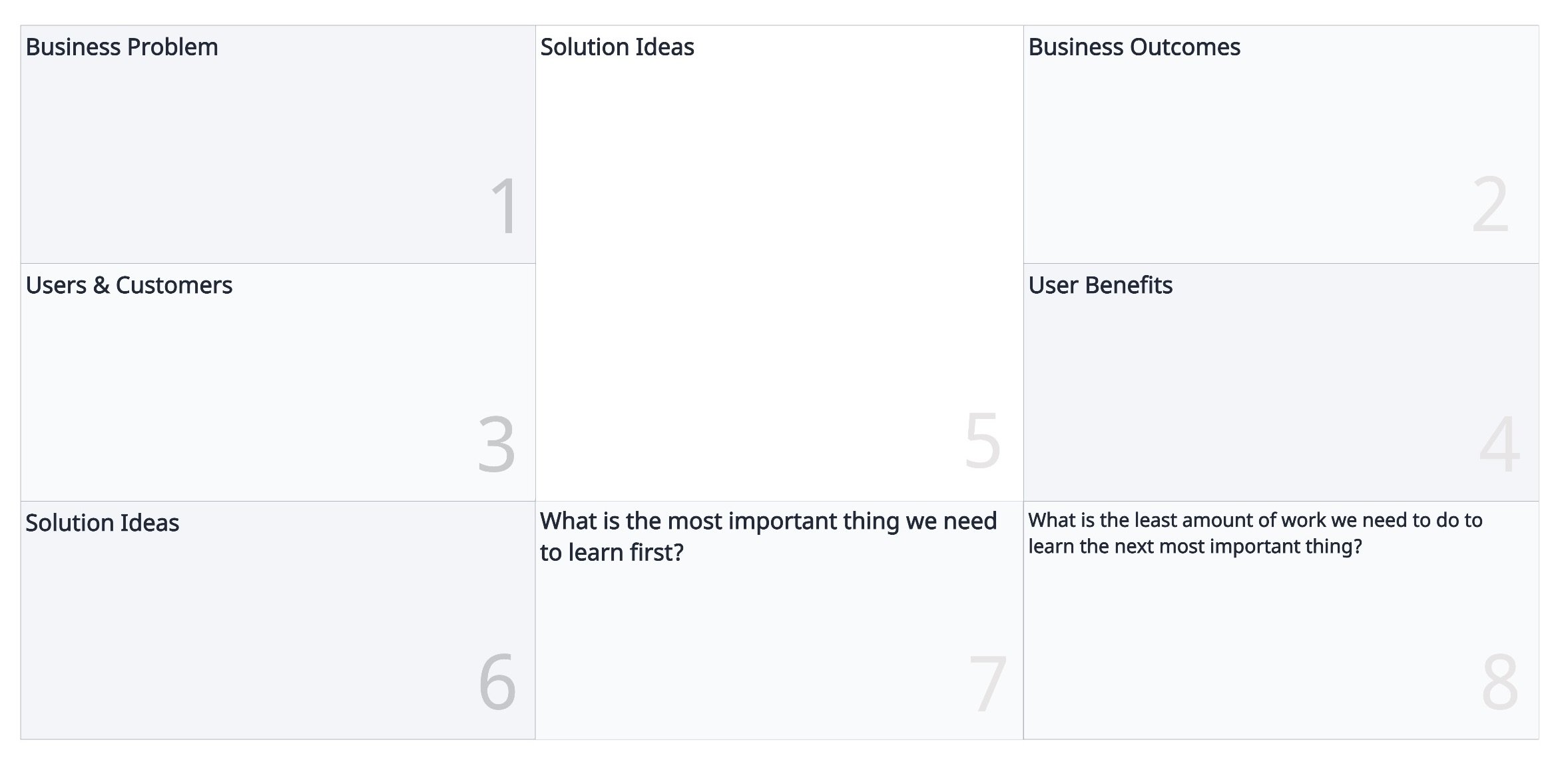
In the Lean UX process, the initial week of the first sprint is dedicated to filling out the Lean UX Canvas. This canvas includes all the tools, methods, and processes associated with Lean UX.
By completing the UX canvas, this really helped my group and I conduct problem framing, brainstorming, and sharing all of our assumptions in our product’s domain.
UX Canvas
Throughout the first week, our group held several meetings to collaborate on each section. We crafted business problems, outlined business outcomes, identified potential users (Proto-Personas), proposed solutions to address user problems, established a hypothesis table, and, finally, outlined our Sprint 1 backlog. This backlog defined the Minimum Viable Product (MVPs) we aimed to test first.
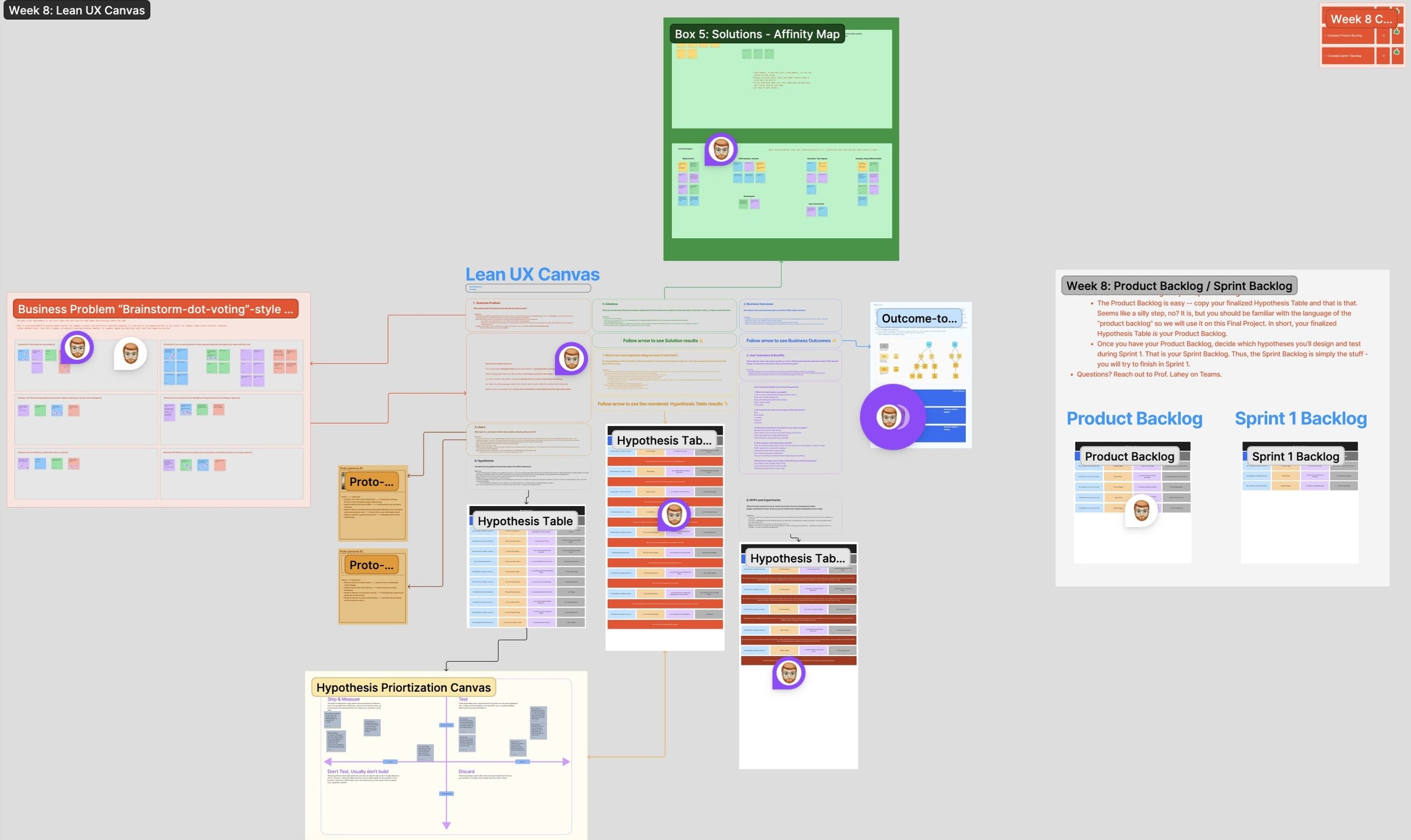
Filled-Out Lean UX Canvas (Week 0)
Proto-Personas
In this week, we developed the first iteration of our proto-personas. Rather than crafting static personas, we created dynamic proto-personas that would evolve and adapt over the course of our sprints.
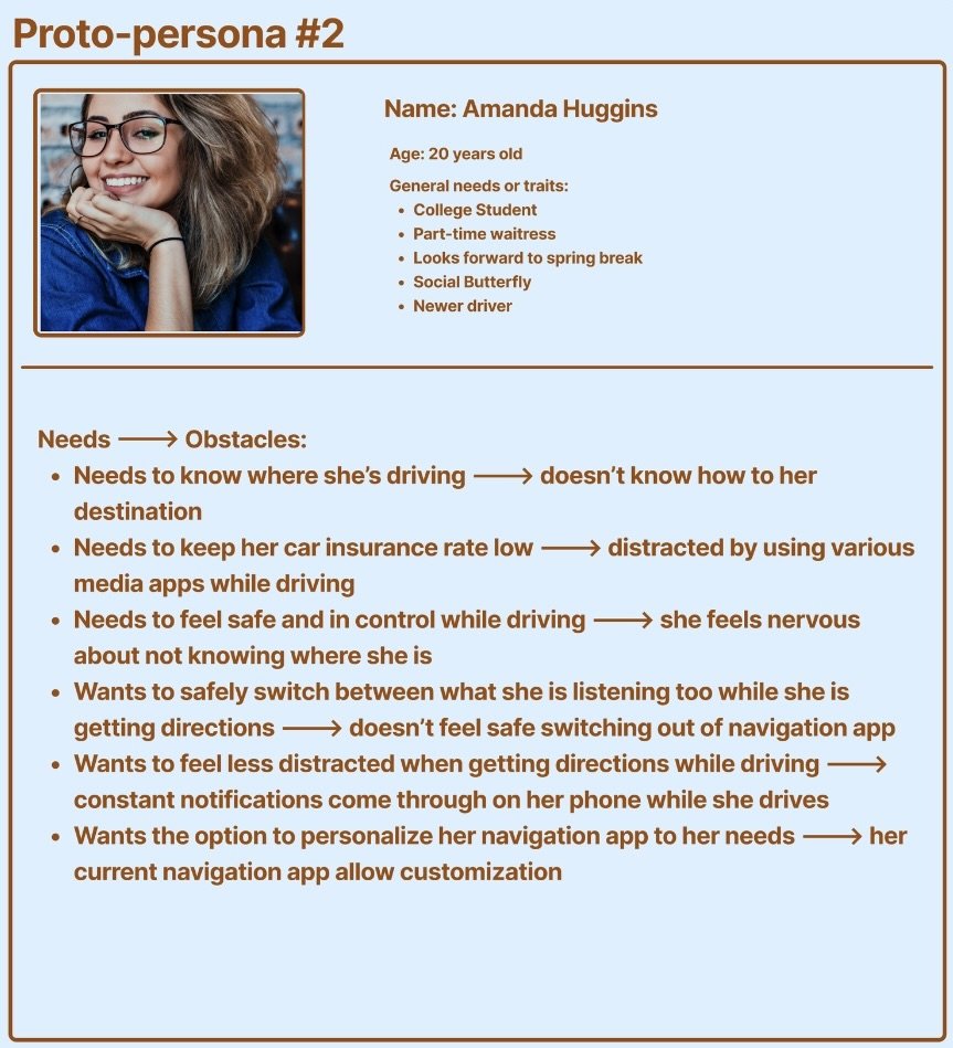
Our two initial proto-personas were Ashton, a passionate driver in his mid-twenties frustrated with the daily hassle of switching between apps while driving to work, and Amanda, a college student and cautious driver seeking a safer way to enjoy music during her drives.

Proto-Persona Ashton (FigJam)
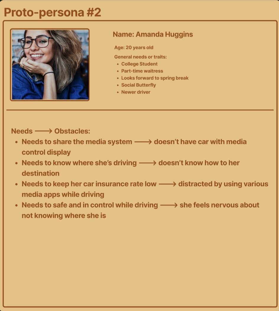
Proto-Persona Amanda (FigJam)
Sprint 1
Backlog
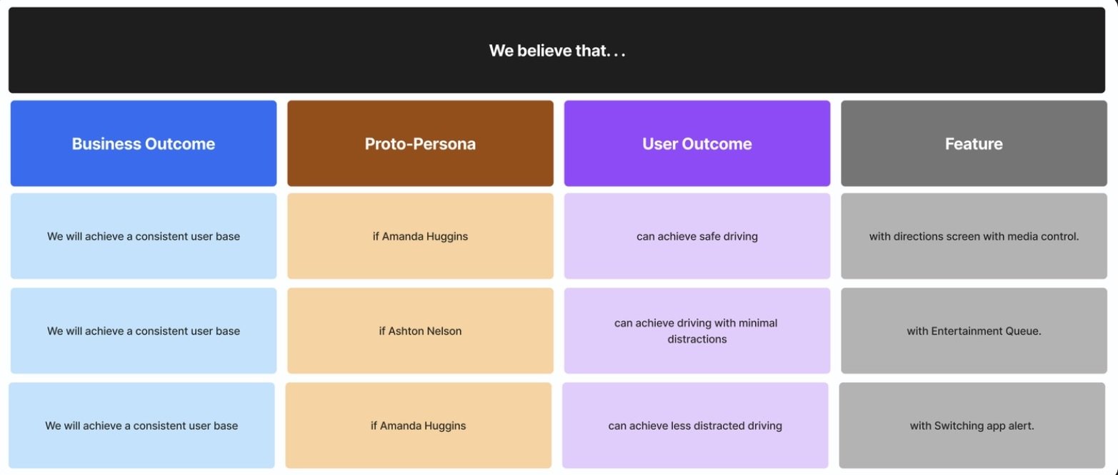
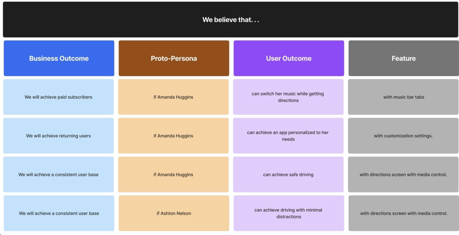
Following the creation of our proto-personas, our next step involved generating solutions to address their problems and determining how to validate these solutions. We formulated a hypothesis table by considering the business outcomes achievable through features beneficial to our proto-personas. These features were categorized, and we established our Sprint 1 backlog based on the priority of testing these features first.
Sprint 1 Backlog (FigJam)
Sprint 1
Week 1 & 2
Bringing Our Assumptions to Life
In the first week of Sprint 1, we started by planning and scheduling interviews with three young drivers who listen to media and use navigation at the same time while driving.
Every two days during a sprint (excluding week 0), our group held stand-up meetings where we discussed tasks to be completed and set expectations for the next meeting or upcoming interviews.
Starting the Interview Process
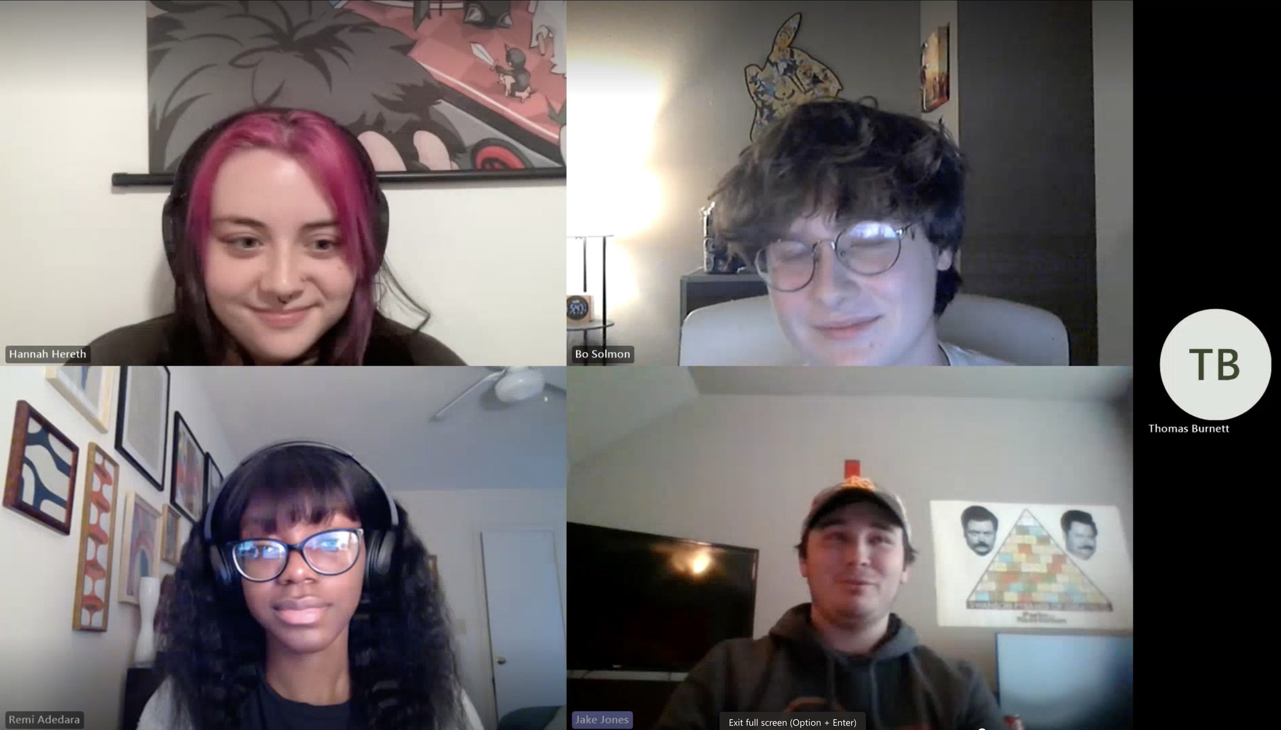
In the first two interviews of Week 1, we didn't have any concrete mockups. Our primary goal was to understand our participants better, specifically how they interacted with their phones while receiving directions and playing media while driving.
Testing Lo-fi Wireframes
Interviews #1 & #2
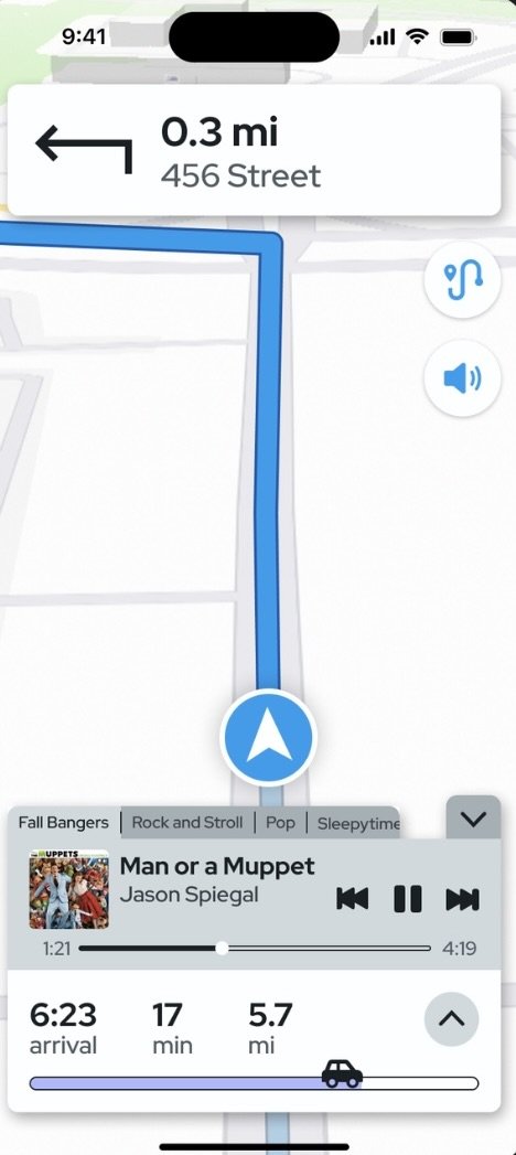
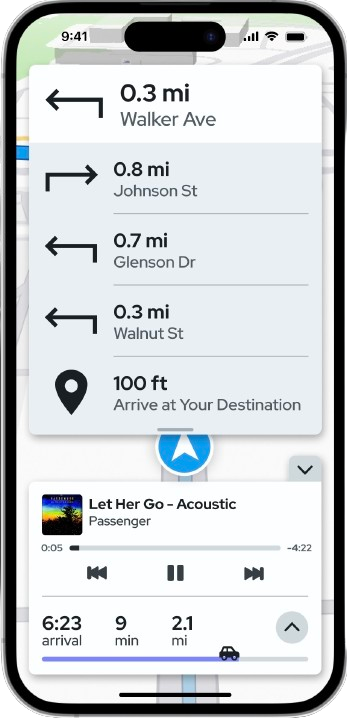
After getting feedback from the first two interviews, we started to work on the rough draft of our app. For the 3rd Interview we show the interviewee a mock up of the navigation screen of Atlas. Since this is the core concept of our app, we considered it the most crucial feature to validate first.
Throughout these two weeks of interviews, our group iterated and adjusted our designs collaboratively on Figma. While considering additional features for testing, I proposed the idea of adding an alert when users switch out of the app. We included this inquiry in the interviews. Alongside the active route screen and pop-up alert, we presented participants with mockups of other features, including an entertainment queue and a queue-sharing feature.

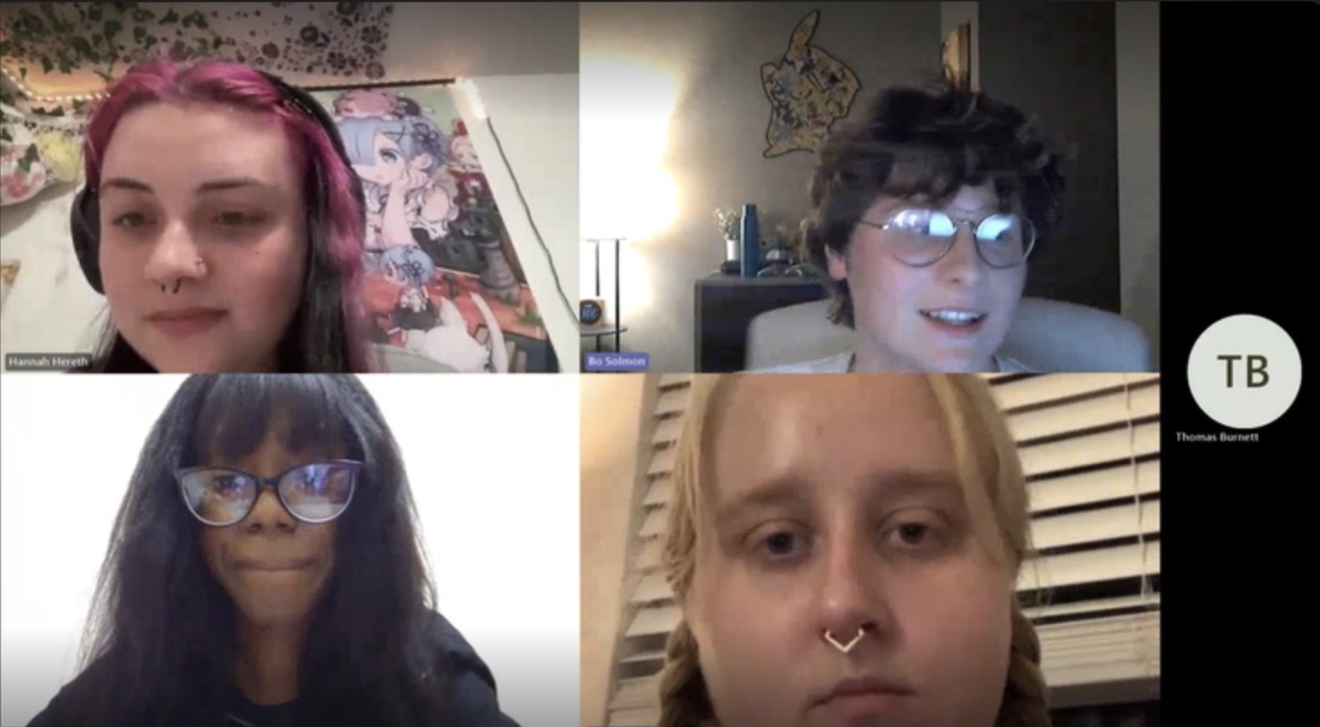
Interview #4
Affinity Mapping
Following each of the 12 interviews, our group gathered together to conduct affinity map sessions. During these sessions, we set an eight-minute timer and documented the most helpful or crucial findings from each interview.
Once the timer finished, we discussed our written notes and grouped together common observations.
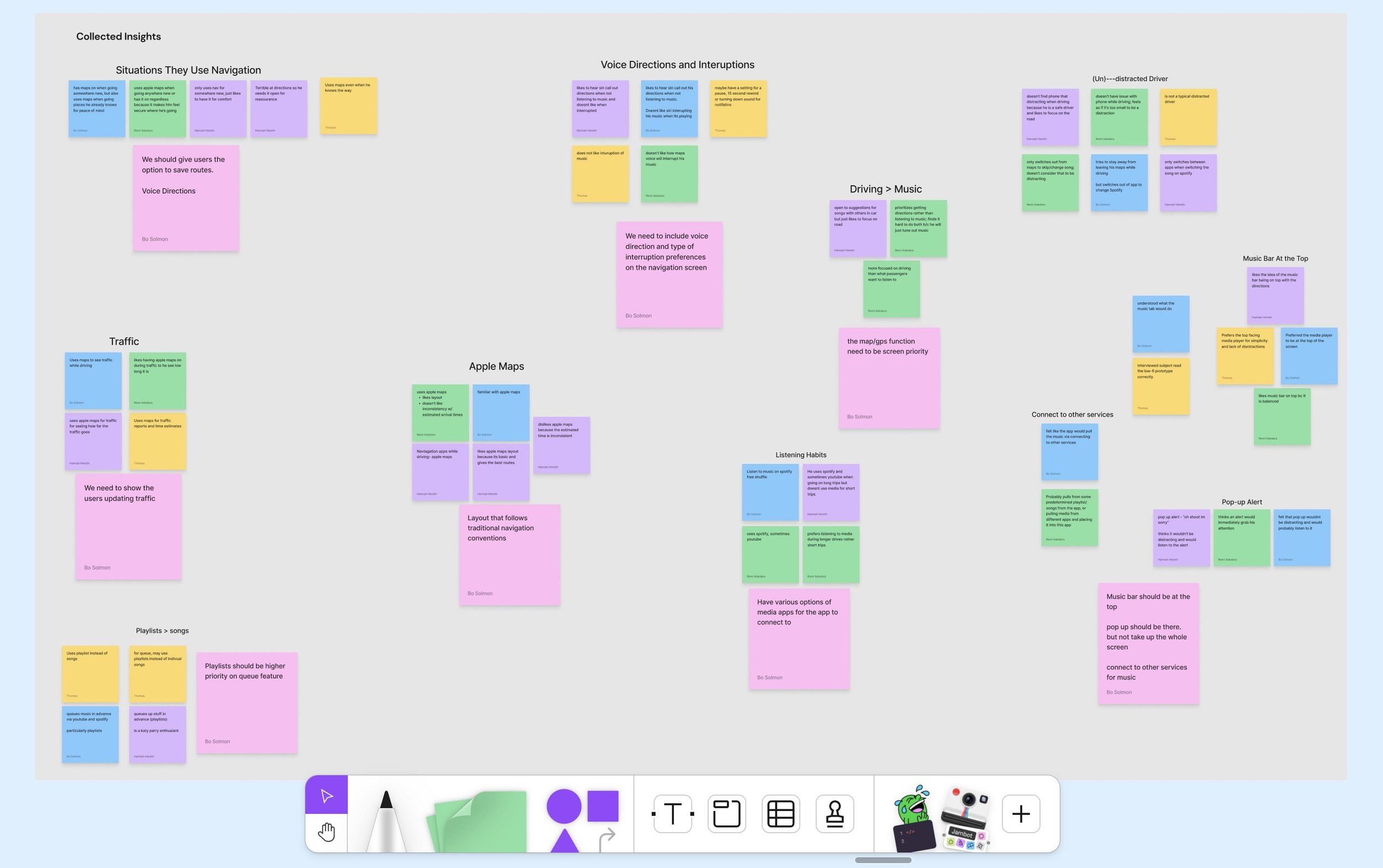
Interview #1 Affinity Mapping (FigJam)
Major Takeaways from Sprint 1
At the conclusion of Sprint 1, we identified consistent patterns among our interviewees, providing valuable insights into the frustrations and needs of drivers. Here are some key takeaways from this sprint:
The alert pop-up was deemed unnecessary, and some participants disliked the idea. While some were okay with the concept, they expressed concerns about potential annoyance if they couldn't control their own driving experience.
The interviewees expressed a liking and interest to the route progress bar. The users felt a sense of safety and security.
Sprint 1 Retrospective
At the end of Sprint 1, we completed a sprint retrospective, which is a board where my group and I responded to the questions “What went well? “What could have gone better? “What will we try next?” During this meeting, we reflected on how Sprint 1 went and how were going to approach sprint 2.
We concluded that we were prepared enough to transition our testing phase to showcase high-fidelity screens and incorporate more usability testing as the interviews progressed.
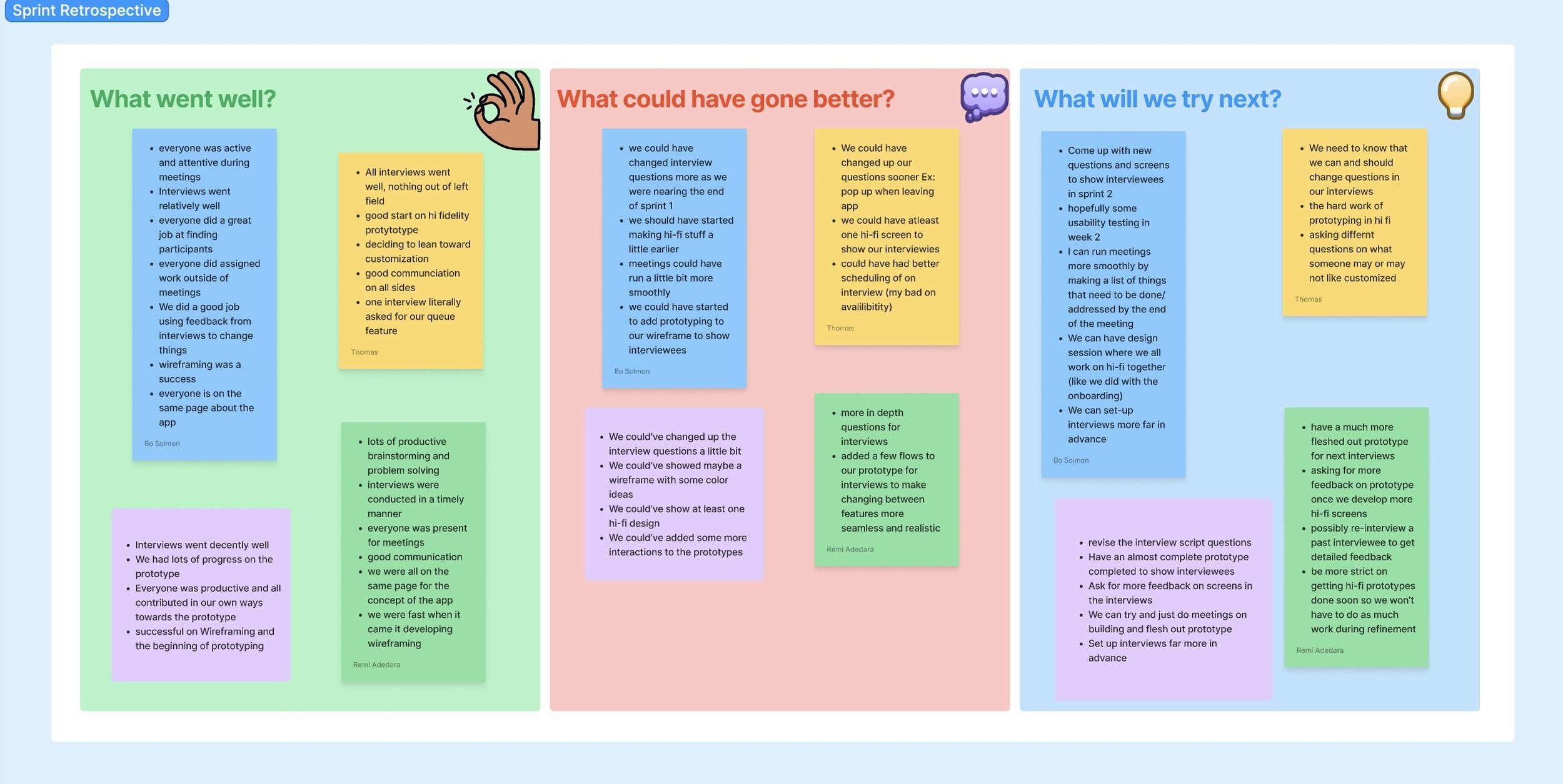
Sprint 1 Retrospective (FigJam)
Sprint 2
Week 0
Revisiting the UX Canvas
In this week, my group and I reevaluated the UX canvas to ensure consisitency with our user research findings and determine if any adjustments were necessary.
Revisiting Proto-Personas
First we revisited the Proto-Personas after sprint 1. We came to a final decision that Amanda, our worried driver, was frustrated with how many notifications popped up while she was driving.
Considering the interviewees' desire for customization, we incorporated the preference for more personalization within a navigation app for Amanda. Additionally, we removed the requirement for her to share her media queue, as none of our interviewees expressed a need for it.
We also eliminated the requirement for her to share her media queue since none of our interviewees expressed this need.
Revisited Proto-persona Amanda (FigJam)
Sprint 2
Backlog
Following Sprint 1 testing, our group determined that certain features in our hypothesis table were invalidated. The alert pop-up and the queue-sharing feature were found to be unnecessary.
As a result, we restructured our hypothesis table and established a new backlog for Sprint 2.
Incorporating features deemed to have high value and requiring testing, such as media tabs on the navigation screen and customization settings, our backlog for Sprint 2 prioritized these elements as our primary Minimum Viable Products (MVPs).
During the Sprint 1 interviews, our interviewees wanted an alternate way to change playlists while driving and not leaving the navigation screen. My group and I brainstormed some ideas in order to fix this problem.
Our group decided on testing playlist media tabs that switches the active playlist during Sprint 2.
Sprint 2 Backlog (FigJam)
Sprint 2
Week 1 & 2
Onto the good stuff.. Hi-Fidelity Prototyping! ~
Over the course of this week, our group aimed to conduct tests on Hi-Fi screens with our interviewees. Throughout the interviews, we showcased the features integrated into our Spring 2 backlog, with a specific focus on evaluating the playlist tabs and customization settings. Additionally, we carried on with the testing of the main navigation screen.
Week 1 - Testing/User Feedback
Rather than questioning the interviewees about their driving habits, our group decided to pivot towards seeking feedback on our new screens. We used the first few interviews of Sprint 2 to help set a foundation of what specific task flows our group wanted to test during the usability test.
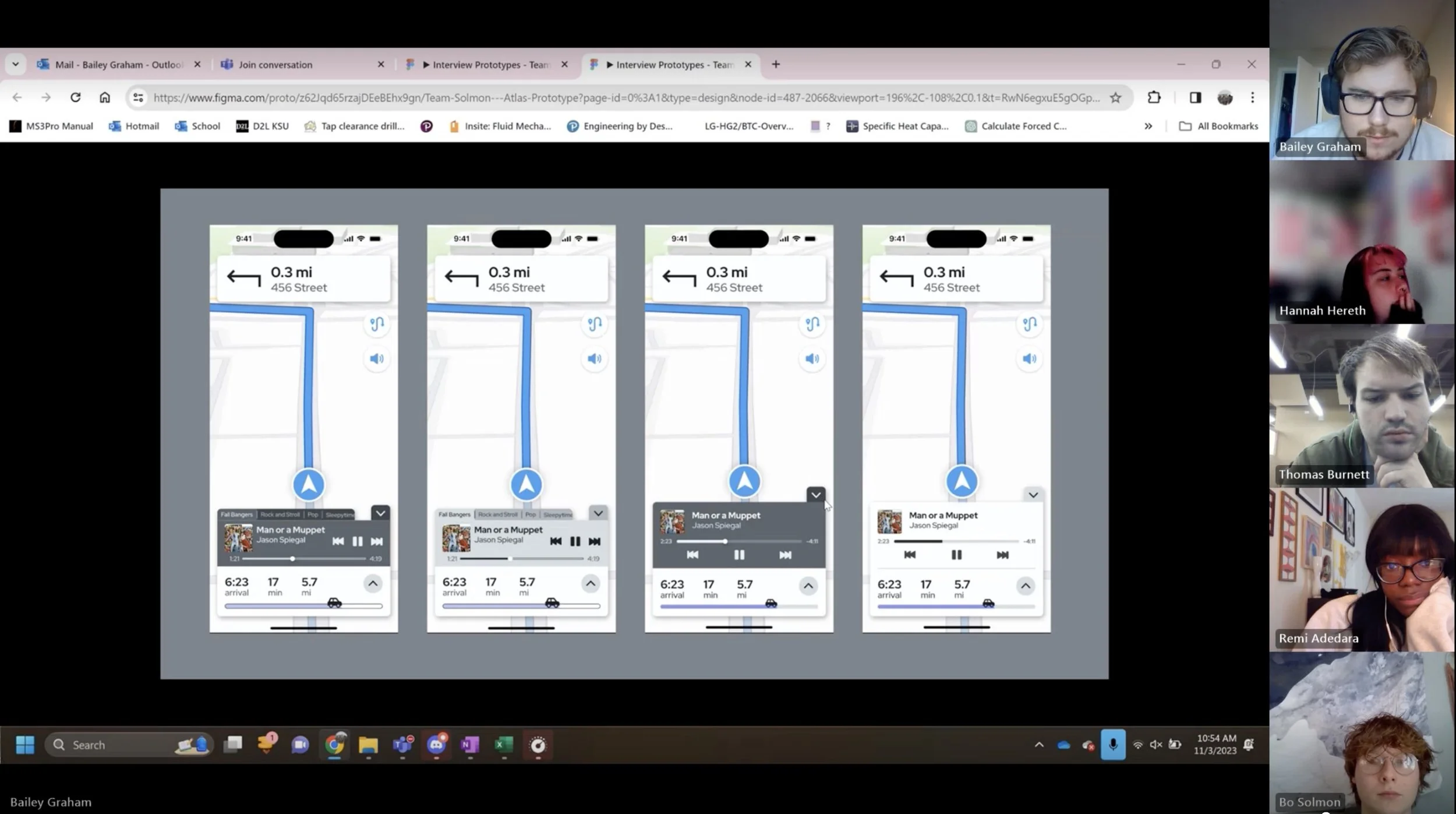
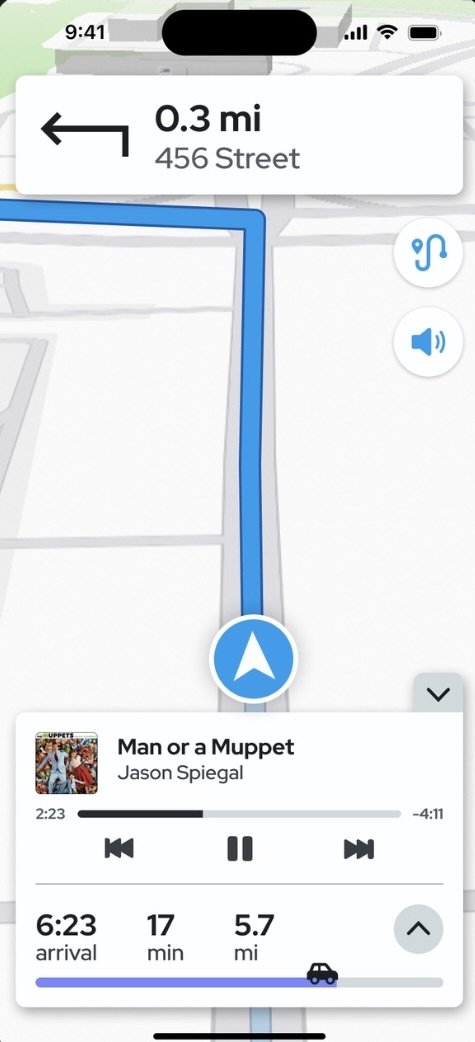
Invalidated Playlist Tabs
At the close of Week 1 in Sprint 2, our team recognized that the playlist tabs were causing frustration among our interviewees. Feedback revealed that the tabs were too small, making them difficult to see or interact with while driving. Concerns were raised about potential distractions, and there were suggestions that enlarging the tabs might obscure a significant part of the navigation screen.
Considering these thoughts, our group made the decision to redesign the media bar in the navigation screen.
Before media tabs redesign

Customization Settings & Onboarding
Settings Home Page
Interviews #7 & #8
After media tabs redesign
While testing the navigation screen and media tabs, I designed the settings and onboarding screens for the app. Customization was centered around the settings, allowing users to personalize the navigation screen, enable the Driver Focus (do not disturb feature), adjust voice directions, and manage their connected media apps.
The interviewees expressed strong enthusiasm and support for the customization settings, considering it a valuable feature to integrate into the interface.

Week 2 - Starting the Usability Testing!

Welcome Screen - Onboarding
At the beginning of the second week, our team introduced a phase where the interviewees had hands-on interaction with our finalized prototype. We decided to invite back a previous interviewee, resembling our Proto-Persona, Ashton, to gather their insights.
Our group prepared a task list, outlining the crucial areas we wanted to assess in our prototype:
Add both the “feel good indie tunes” playlist and the song “Wandering Star” from the Spotify tab to the queue
Start a drive to “Burger King”
Locate the media queue while on the directions screen
Locate the directions list on the directions screen
Add “Burger King” to the favorites list and change its saved name to "BK”
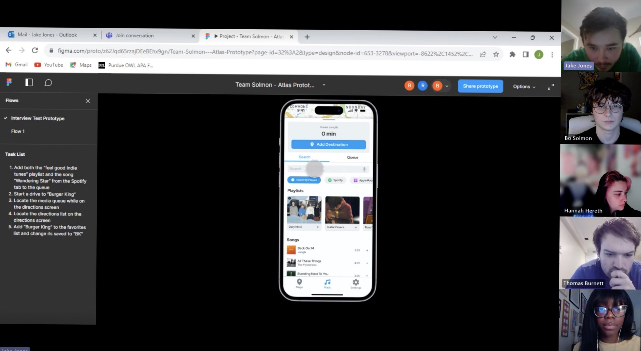
Interview Session #11/Usability Test #2
Sprint 2 Retrospective
Like Sprint 1, we completed another sprint retrospective to reflect on everything we accomplished so far and what we wanted to approach in the refinement stage.
Our proto-personas, Ashton and Amanda, stayed relatively consistent, reflecting minimal changes, as we confirmed their frustrations and needs through our usability tests.
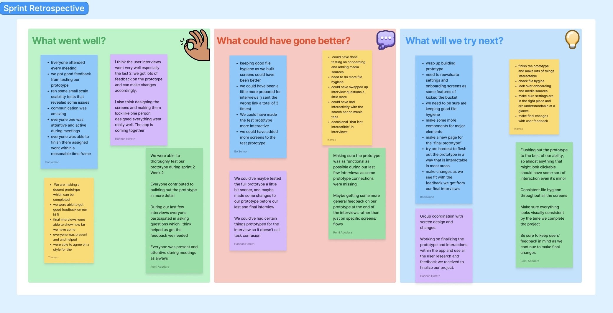
Sprint 2 Retrospective (FigJam)
Refinement
Keeping it all consistent.
After sprint 2, our group had a week of refinement where we were able to include all of our input and feedback from our interviewees. We also took this week to polish our design and make it one coherent design throughout the interface. We successfully created a consistent style guide and followed a 8 point grid.
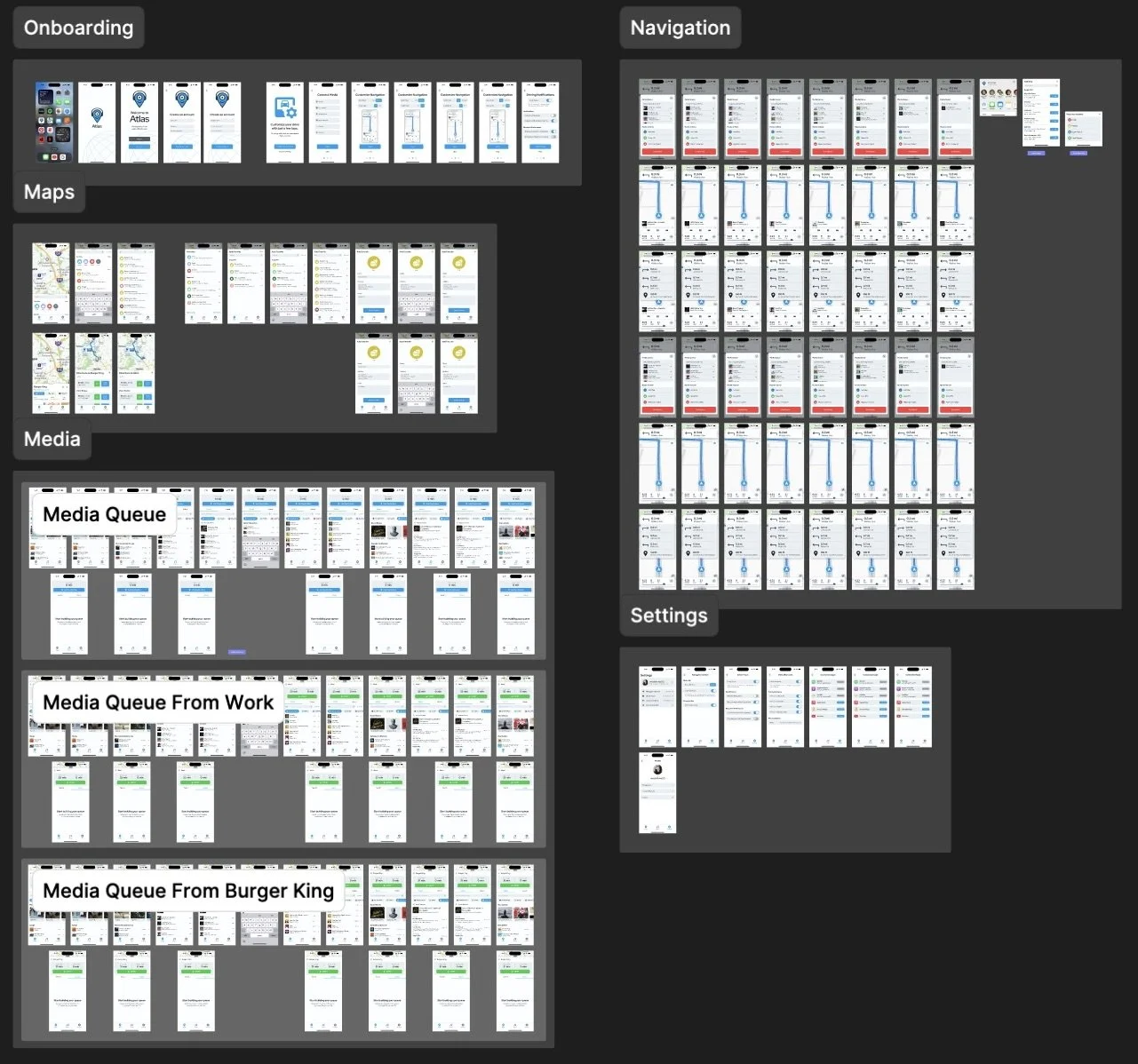
Atlas, full prototype
Final Product
Atlas, Combining Navigation & Entertainment.
Over the span of 8 weeks, my group and I managed to develop a fully functional interactive prototype for Atlas, an iOS mobile app designed to enhance the safety of drivers accessing media while on the road.
Media Queue
Drivers have the option to create a media queue using different media apps, reducing the time spent selecting or changing songs while driving.

Navigation
Allowing drivers to customize their driving experience to their own personal needs.


Making it easier and safer to use media and navigation while driving.

Customizable Settings


Reflection
Hard Work Pays Off!
I really enjoyed working on this project with my teammates. The Lean UX approach was definitely a challenge and a very new concept to me so I learned a lot during these 8 weeks.
Takeaways
Communication is key. Holding meetings every week during this project really helped me stay on track and we could plan tasks ahead of time so we were never behind on the schedule.
Finding the right interviewees. Interviewing individuals who closely matched our proto-personas allowed us to confirm or reject our assumptions much faster.
Making mistakes is apart of learning! Making mistakes in design is apart of the process. The more you make mistakes, the more you improve your problem solving skills.
Revisiting designs can be fun! I used to strive for the perfect design on the first attempt, but after working on this project, I find it extremely rewarding when refining and enhancing the design with each iteration.